I was approached by a friend of mine to create some content for a nonprofit proposal. I embrace small, fun projects as a channel to design with more freedom, so of course, I jumped!
She's training in Occupational Therapy (OT). It's much like Physical Therapy but focused on restoring daily tasks. The goal is to improve quality of life and independence more than physical (or muscular) function. OT can involve things like developing fine motor skills, but this project is a little different.
The proposal is for a mobile therapy center to provide reminiscence therapy for senior citizens in low-income areas of Austin.

Reminiscence therapy triggers happy memories to stimulate the brain in positive ways. It's proven in studies to help with Depression, Parkinson's, and other cognitive issues in elderly populations. Their target patient age is 60-80, so their childhood memories fall from the late 30's to the 50's.
A Mobile Home is outfitted with objects from 1930-1950. Groups of 2-3 are paired with a therapist into the mobile home and recall positive memories. The mobile home can serve community centers like churches and recreational facilities as well as individual homes.
The project is coined "No Place Like Home."
I was super stoked to provide support on the project! The concept of reminiscence therapy feels like an exercise in emotional health. There's already a natural narrative about searching for belonging and comfort we've all felt before.
There was no lack of inspiration. The time period encompassed World War 2 ('The Good War') and Midcentury Modern design aesthetics. It was a sort of blissful period for design that people love to reminisce and reflect on today.
I decided on an open door as the main graphic.
It transforms a house into a home. It also represents a door to memories and a different time--a reference to the therapy.

The typeface I chose reflected script fonts from classic brands. Many brand redesigns during this time were merging hand-painted designs and more machine-influenced aesthetics. Futura was created at this time and the Bauhaus blossomed.
Instead of using primary colors (red, yellow, blue), I chose to feature tertiary colors (purple and teal). Dusty blues and warm grays hint at a vintage origin.
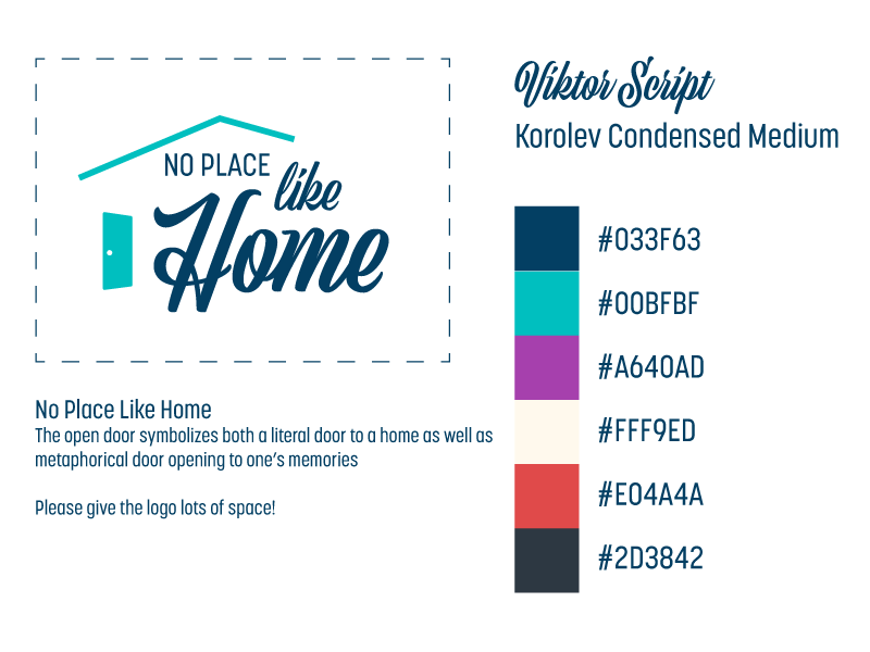
The brand guide is simple in order to serve non-designers
Overall, I'm satisfied with the result of such a quick project! I hope they make the proposal a reality.
